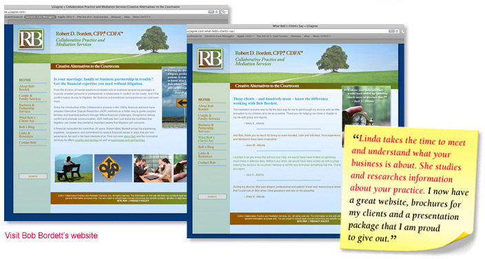
ROBERT D. BORDETT
A re-branding process always requires a close look at the color palette, especially when it comes to the website. The colors of the logo dictated the colors of the website, with the addition of a soothing sky blue. The image of the path going off into the distance toward a solitary tree conveyed exactly the feel needed for this site (and for the brochure!).
We used the blue and green as primary colors and took the brown from the logo as an accent color. The images all coordinate with the color palette, and visitors to the website feel reassured about Bob's professionalism, expertise and objectivity – as well as his empathy for what his clients are going through.
|