WHO THEY ARE: A 20+ year-old private security firm specializing in security services for Class A commercial buildings.
WHAT THEY NEEDED: A unified look and feel to their brand that would reflect their history of continued success and growth, as well as their place in their industry.
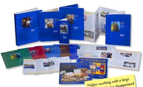
WHAT THEY GOT: A new look was created for all Barton’s print collateral. We brightened up everything, giving all the covers the same look and feel, with different photos and headlines. This enabled Barton’s message to be more focused in across the board, and gave its existing tagline / mission statement more prominence.
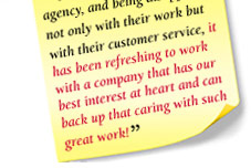
WHY THEY LOVED IT: Shortly after we created an image for Barton that was equal to its status in the marketplace, the company was able to merge with Allied Security, forming one of the largest security companies in the US.
|