  |

DIVORCE INNOVATIONS, LLC
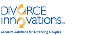
Divorce is obviously a very sensitive issue, so when branding this new partnership recently, the symbology and iconography were critical. The logo needed to convey the company's focus in a way that would not offend or scare away divorcing couples. Using the letter "O" in both words, we created a symbol that evoked wedding rings, separated and moving in different directions. The three partners agreed unanimously on the logo, and all their professional colleagues as well as their clients have responded positively.
See their website and brochure to get the total brand look and feel!
|


